The Paths We Take: How Movement Shapes Experience in Schools  

3D diagram of a building showing social distancing, with green agents representing social distancing, red agents not social distancing, and blue indicating proximity hotspots between agents at a small world entry.

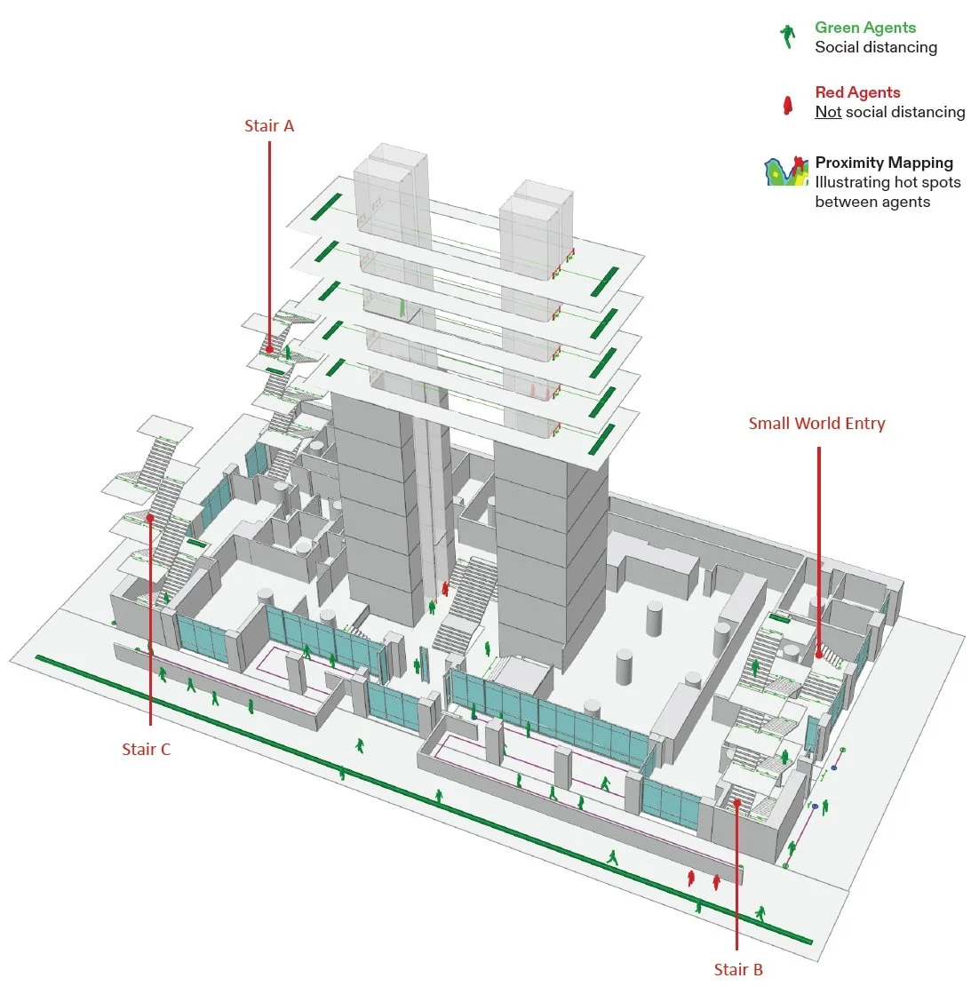
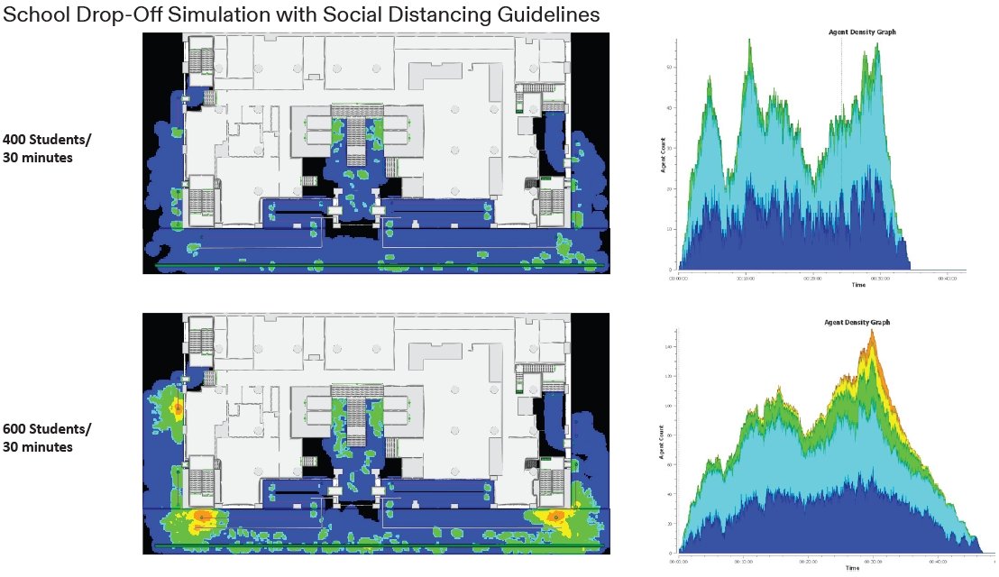
Let’s talk about Movement. By utilizing pedestrian simulation analysis, we helped schools to reopen safely during the Covid pandemic.

Comparison of social distancing during school drop-off with 400 students versus 600 students over 30 minutes, showing increased congestion and density with more students, represented by heat maps of the school grounds and agent density graphs.

Proximity Mapping

  • Illustrating hot spots between agents

Designing with movement allows for rethinking dining halls for achieving a better and efficient layout.

A layout diagram of a cafeteria or dining hall with color-coded agents from four departments, tables, and service areas, showing paths and positions of agents with a legend indicating departments and colors.
Diagram of people flow with heatmap overlay, showing paths of individuals in an indoor space with benches and a robotic device.
Color-coded layout of a small indoor course or park with pathways, green areas, and several small structures.

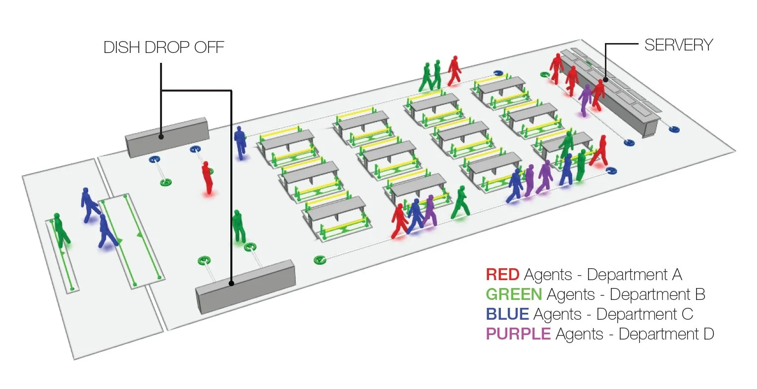
Case study - Dining Hall

By leveraging pedestrian simulation analysis into campus master-planning, we can create more efficient and experiential circulation networks.

Two maps showing foot traffic patterns in a school campus with paths traced in red. The left map illustrates foot traffic mostly concentrated around a large building, while the right map depicts more dispersed movement across the campus, including outdoor areas.

By leveraging pedestrian simulation analysis into campus master-planning, we can create more efficient and experiential circulation networks.

Pedestrian flow diagrams for a K-12 campus: The image on the left shows pedestrian flow at drop-off time. The image on the right shows the pedestrian flow during the school day.